
Kazoo website redesign


UI/UX DESIGN


UI/UX DESIGN
Kazoo
website rebrand
When the companies YouEarnedIt and HighGround merged to become Kazoo, creating a new website that reflected the new Kazoo brand became a top priority.
The Kazoo website was a result of 3+ years of design work, testing, and development from myself and a small team of developers and marketers.
Here's some more info about the design system, layout structure, and brand aesthetic I created for the site:
Current project
UX/UI Design
New Hero Images
Restyling the hero images helped transform the whole look and feel of the website. I started with a shape that mirrored the curved rectangles we see throughout the Kazoo platform and app. Using this curved rectangle shape as a base, the next step was combining different parts of our color palette with layered, abstracted depictions of our product UI (example on right).


UI /UX DESIGN
Unified Typography
As part of creating a larger design system, I started by creating a consistent typographic language across the site. While this presented a large challenge for a site that housed over 70 pages and hundreds of pieces of legacy content, it was essential to nail down typographic parameters that could fit all these different types of pages and create unity throughout the site.

UI/UX DESIGN
Modular
Layouts
In the interest of making our website more scalable, repeatable, and easier to update, we had our developers build custom panels, which served as our website building blocks. That meant we could go into Wordpress and select from a dropdown menu, which layout components we wanted to build on that page and update it ourselves, without having to rely on developers or build pages ourselves from scratch. Switching over to this method made website maintenance much faster and more efficient.
UI/UX DESIGN
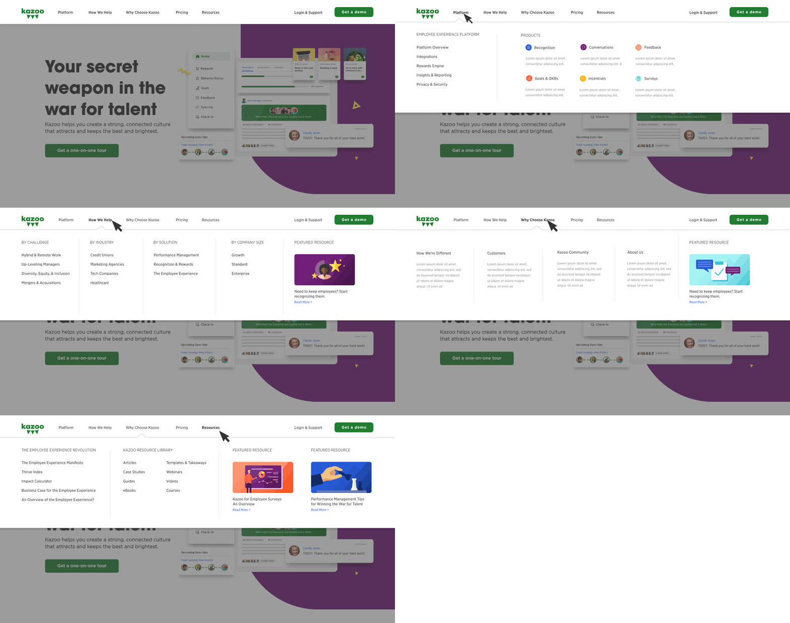
Mega-Menu
As our page numbers grew and our product offerings expanded, we knew we would have to build a more robust menu that would allow for more complex navigation. I designed this full-width mega-menu in such a way that it allowed us to organize pages into multiple tiers and topics; it allowed us to feature important resources or latest blog posts; and it even gave us the structure to include iconography and page summaries within the menu itself. Most importantly, it was built with a flexible structure that can expand to accommodate more complexity and growth in the future as our offerings increase.
